
This article linked at the bottom of this addresses climate and misleading data (whether intentional or not). The motivation for this article is a tweet/graph put out by Chris Martz, who I consider to be very smart but also outspoken/arrogant and who I’ve found to be 100% wrong at times as I’ve pointed out.
Chris’ graph tries to downplay GW by saying that the frequency of US 95F+ highs has decreased 1961-2020 vs 1901-1960. He tweeted on 7/18/26:
“Thankfully I have numbers rather than opinions. The average number of days per year in the U.S. reaching 95°F was ~18% lower during the 60-year period 1961 to 2020 compared to 1901 to 1960.The number of days reaching 100°F and 105°F have also declined since 1895.”
https://x.com/ChrisMartzWX/status/2078566117711196362
The following article is a response to this tweet.
JUL 22, 2026
“First, the Dust Bowl was real, and it remains the benchmark for multi-year extreme daytime heat in the central US, in adjusted and unadjusted data alike.”
“Second, it was a regional phenomenon”
“Third, raw daily data is the wrong tool for this question. Time of observation changes and the 1980s switch to MMTS sensors both suppress modern hot day counts relative to the past, and the raw and homogenized series diverge almost exactly when the instrument transition happened. In homogenized data, recent decades rival the 1930s even averaged nationally.”
“Fourth, hot days above a fixed threshold are a narrow and noisy way to look at the data. The overall US warming trend (around 0.5F per decade since 1970 in max, min, and mean temperatures) is robust in every dataset, raw or adjusted, satellite or surface. And globally, days above 95F have been climbing steadily for a century, with no Dust Bowl bump at all: the central US is one of the few spots on the planet where the mid-20th century still holds the record for extreme daytime heat.”
“The viral chart is built from real measurements, and the heat it shows was real too. But it takes a regional catastrophe, fails to account for changes in instruments and observation times, and presents the result as a national climate verdict. Accounting for the thermometers and the geography, and the US looks a lot like the rest of the planet: the hottest days on record are increasingly the ones we are living through now.”
https://www.theclimatebrink.com/p/hot-days-cold-thermometers
Climate Research Lead, Stripe; Breakthrough Senior Fellow
Zeke Hausfather is a climate scientist and energy systems analyst whose research focuses on observational temperature records, climate models, and mitigation technologies. He spent 10 years working as a data scientist and entrepreneur in the cleantech sector, where he was the lead data scientist at Essess, the chief scientist at C3.ai, and the cofounder and chief scientist of Efficiency 2.0. He also worked as a research scientist with Berkeley Earth, was the senior climate analyst at Project Drawdown, and the US analyst for Carbon Brief. He has masters degrees in environmental science from Yale University and Vrije Universiteit Amsterdam and a PhD in climate science from the University of California, Berkeley.
++++++++++++=
Zeke is a smart guy with lots of degrees but the article that you copied shows that he needs to go back to school to learn more in order to better understand agronomy, soil moisture (and how they impact surface heating from UV radiation) and the physics of greenhouse gas warming using quantum mechanics and thermodynamics IN THE REAL WORLD!!!
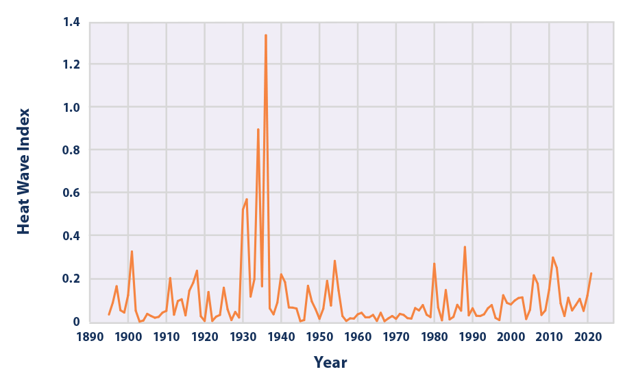
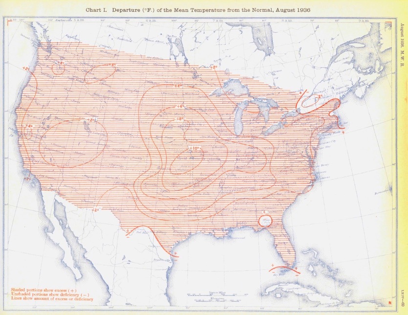
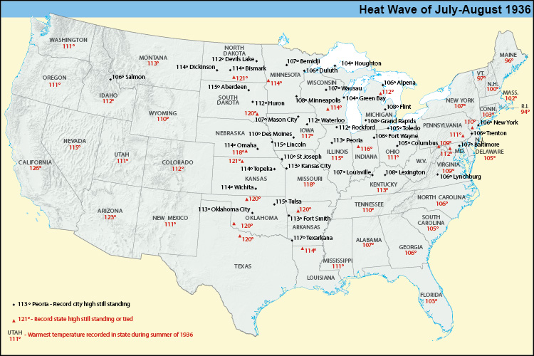
1. The 1930s daytime heat was every bit as intense as measured. It was not partly an artifact of flawed instrumentation.
Figure 3. U.S. Annual HeatWaveIndex, 1895–2021
https://www.wunderground.com/cat6/North-Americas-Most-Intense-Heat-Wave-July-and-August-1936

+++++++++++
Why was the heat so much hotter that particular year??

+++++++++++++++++
While this period above was the HOTTEST and DRIEST of the 1930's, the same exact principle/physical law applied for the rest of that decade. The drier the soil is, the more of the sun's UV radiation will go directly into heating the air above the ground and the less radiation will go towards evaporating moisture.
The drier the soils, the hotter the Summer DAYTIME readings will be and this turns into a positive reinforcement as that intense heat dries out the soils even more and causes the air masses to lack moisture when fronts come thru. Drought begets drought.
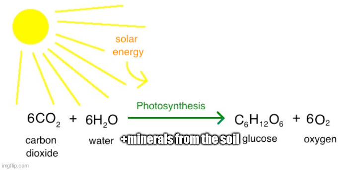
Zeke doesn't understand what photosynthesis does to REDUCE daytime heating!!!
Air above bare, dry soils heat the greatest. Vegetation reduces DAYTIME heating from several factors.
1. Evapotranspiration!
2. Shading of soils
3. Less absorption of the heat. In fact, photosynthesis converts the heat/kinetic energy from UV radiation into stored/potential/chemical energy. This can be used for food or for burning fuel, when the heat energy comes back out.
Farmers have become extremely good at planting corn in much more tightly packed rows during the past 6 decades across a massive area covering the Midwest. This has created a micro climate that's PROTECTING us from severe droughts and causing a crystal clear drop in 95+ high temperatures.
We've only had 1 widespread, severe long lasting drought in the Cornbelt since 1988, in 2012. This is mind boggling.
We can see this pattern here
Climate change in the United States, with 100% certainty is helping to protect us from widespread severe droughts.
Summer Climate Change in the Midwest and Great Plains due to Agricultural Development during the Twentieth Century
https://journals.ametsoc.org/view/journals/clim/32/17/jcli-d-19-0096.1.xml

++++++++++++++++++++++++++++++++++++++++++++++++++++

++++++++++++++++
https://wattsupwiththat.com/2026/04/03/us-heatwaves-much-worse-in-past/

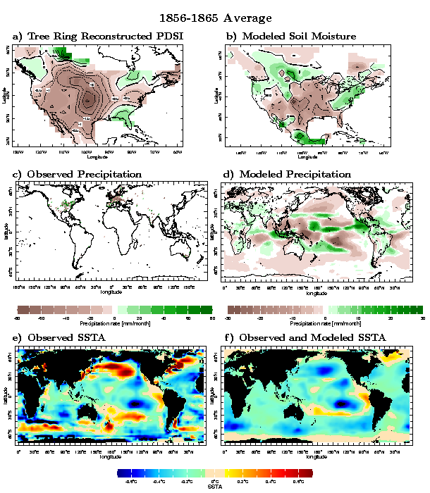
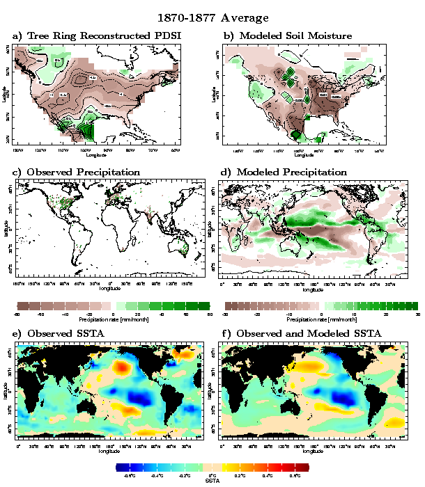
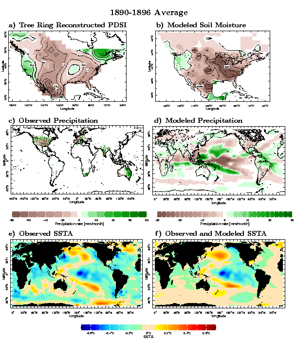
Ironically, humans burning fossil fuels, warming the entire planet are also helping to protect us from the widespread Dust bowls that happened because of cooler global temperatures and lower CO2 levels in the 1800's.
Global cooling and LOW CO2 levels are what cause MORE widespread, extremely long lasting droughts with catastrophic global and huge regional famines!
Causes and consequences of nineteenth century droughts in North America
https://ocp.ldeo.columbia.edu/res/div/ocp/drought/nineteenth.shtml
++++++++++++++++++++++++++++++++++++++++++++
You want a REAL climate CRISIS?
This is what it looks like:
Can you imagine if this below happened today? It's less likely because climate change and the current climate OPTIMUM is helping to PROTECT US!
The planet had a REAL climate crisis between 1876 and 1878.
50 million people died. 3% of the global population died from that real climate crisis!
https://news.climate.columbia.edu/2017/12/15/causes-great-famine-drought/

The Great Famine killed an estimated 12 to 29 million people in India. Image
https://ui.adsabs.harvard.edu/abs/2017AGUFMGC51F..04S/abstract
The 1876-1878 Great Famine impacted multiple regions across the globe including parts of Asia, Nordeste Brazil, and northern and southern Africa, with total human fatalities exceeding 50 million people, arguably the worst environmental disaster to befall humanity.
NASA EXPLAINS THE DUST BOWL DROUGHT
https://www.nasa.gov/centers/goddard/news/topstory/2004/0319dustbowl.html
Additionally, I've mentioned this one numerous times this year during recent heat waves.
CO2 is mainly impacting dry places the most. COLD=DRY. DESERTS=DRY.

++++++++++++++++++
The reason for this is the physics of how greenhouse gas warming takes places via the absorption of the heat at various radiation bands.
Re: Re: 6-25-26 MAJOR heat(humidity) wave coming next week
By metmike
Much appreciated, Larry!
Here's another reason why most of the temperature forecasts in the humid areas with wet soils are busting from being too high and one of the things that guys like Jeff, apparently don't understand about the physics of the atmosphere in the very humid areas compared to dry areas.
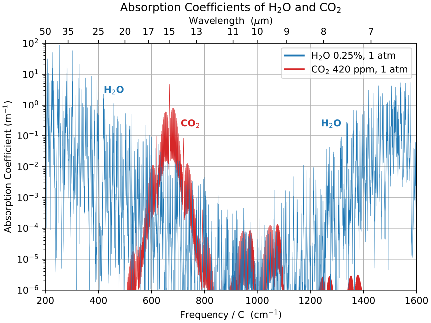
We discussed this at length about why the West and deserts are warming faster than other regions at the same latitude. The highest/coldest/driest areas of the Northern Hemisphere are warming the fastest. H2O swamps CO2 at several radiation absorption bands that they have in common when its warm and humid. Low H2O means that radiation absorption band has room for CO2 to absorb additional heat radiation.
High H2O means LESS room for heat absorption at numerous radiation bands. So very warm, humid air masses WARM THE LEAST from CO2 greenhouse gas warming. Cold/dry the most.
This is why the warming has mostly been in the higher latitudes(and DESERTS).
Not that much heating from CO2 during heat waves that feature extremely high humidity, like this one.
https://commons.wikimedia.org/wiki/File:Longwave_Absorption_Coefficients_of_H2O_and_CO2.svg
So this current heat wave is almost entirely from natural variation. No contribution from the developing El Nino and very little impact in the humid areas from climate change.
A warmer atmosphere can hold more moisture and that is a positive feedback for additional green house gas warming from the extra H2O.
However, higher moisture also reduces the warming from CO2 at some radiation bands.
it sounds confusing and there’s uncertainty As well as how will imoact global warming.
+++++++++++++
So another point here is that in the 1930's, the bone dry soils in the Plains, Midwest and Ohio Valley made them similar to the DESERTS of the Southwest. As we all know, those deserts can hit 110 degrees from weather systems in the Midwest or south only feature a high temperature of 95!!
Also, those same areas today have the BIGGEST increase in moisture/H2O and this is almost saturating the CO2 radiation absorption bands.
The added moisture is also greatly contributing to much lower lifting condensation levels and MORE CUMULUS CLOUDS that at form in the afternoons.
Also, the population of the United States has tripled since the 1930's. I know that homogenization of the temperatures is supposed to factor that in but there is a much more pronounced heat island impact to the much larger urban areas compared to 90 years ago.
https://en.wikipedia.org/wiki/Demographic_history_of_the_United_States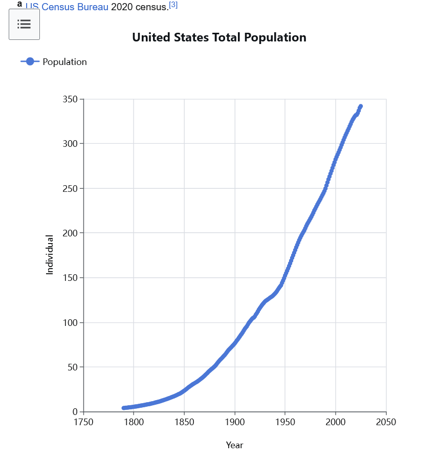
Also, it's true that the Plains and Midwest may only represent 2% of the area of the planet, but it's the highest food producing with the most fertile soils and best weather on the entire planet!!!!
Mike said: “The 1930s daytime heat was every bit as intense as measured. It was not partly an artifact of flawed instrumentation.”
————————
Thanks, Mike!
From his article, Zeke agrees. But the rest of this paragraph states the problems with the way Martz used the raw data. He isn’t at all downplaying the DB’s extreme intensity. But he’s essentially saying that the way Martz presented the data is deceptive for the reasons Zeke stated:
“The 1930s Dust Bowl really was an extraordinary period of extreme heat in the US, and no amount of correction for changes in measurement techniques over time makes it go away. But the graph is also a case study in why you cannot naively count threshold exceedances in raw daily station data and call it a climate record. Its results rest on two well-documented thermometer problems that artificially depress modern hot day counts, plus a station network that happens to be oversampled where the Dust Bowl happened.”
———————
Wxfollower: Why early 20th century data vs late 20th/early 21st isn’t an apples to apples conparison:
1. The first is time of observation bias. Volunteer observers read and reset their max/min thermometers once a day. In the early 20th century most did so in the late afternoon, near the hottest part of the day. An afternoon reset means a very hot afternoon can get counted twice
2. The second is the thermometer switch. In the mid-1980s NOAA replaced liquid-in-glass thermometers in wooden Cotton Region Shelters with electronic maximum-minimum temperature sensors (MMTS) at most cooperative stations. Quayle et al (1991) showed the new sensors read maximum temperatures around 0.4C (0.7F) cooler than the old shelters.
——————
Zeke: regarding the above 2 issues
“The two datasets agree that the 1930s were exceptional. Where they disagree is the modern era: in the homogenized data, recent decades rival the Dust Bowl years CONUS-wide, with 2011 (16.1 days) actually edging out 1936 (14.0 days) as the biggest year in the Berkeley Earth series.”
Thanks, Larry. Yes I read that.
Here's more:
https://www.ncei.noaa.gov/pub/data/ushcn/papers/quayle-etal1991.pdf
The biggest factor for the extreme highs in the 1930's by a wide margin was NOT that(maybe responsible for as much as 1 deg. F and the other XX degrees in the hottest days during that period was from what I explained.
The Plains and Midwest had bare, bone dry soils. Exactly like the soils in the Desert Southwest.
As a meteorologist that had to forecast the real world with wet Summer soils and dry Summer soils, for decades, I can tell you that almost everybody UNDER estimates this impact.
Models underestimate it. Meteorologists underestimate it when it's their backyard but extraordinarily dry or wet compared to what they are used to.
Every forecast in the Midwest in almost every location was too hot for the entire heat wave here because of our wet soils.
During the 2012 widespread drought, highs exceeded the forecast almost every day because of the dry soils.
The opposite impact has been happening in recent decades. Extreme heat in the Summer is LESS in the Midwest because of vegetation and evapotranspiration as farmers have created a beneficial micro climate.
The drought was pretty widespread at times, NOT just regional.


Note on the graph above that the extreme spikes higher have been greatly reduced since climate change kicked in the last several decades.
The higher soil moisture(vegetation) is keeping a lid on the extreme 95+ and 100+ temperatures that were so common in the past.
I can agree with him on this below but the dynamic is DIFFERENT in the Plains/Midwest.
One of the biggest reasons for that area to be so productive year after year, with massive crop yields is the unique location with access to the Gulf of Mexico, loaded with H2O.
Not just higher humidity(crowding out/overlapping CO2 radiation absorption bands but keeping soils moist).
Most inland locations around the planet are not so fortunate. They are drier and not covered in crops so the increase in CO2 adds more daytime heat(even though it's temperatures at night that have warmed the most on the planet).
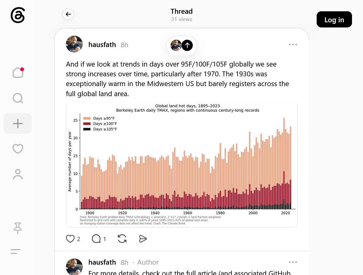
And the difference between the cooling highs in the Midwest and the MUCH HOTTER highs in the (DRY) West couldn't be more pronounced.
But we are focusing on the Midwest/Plains in this discussion.
Please note the all time state record high temperatures below.
Despite the thermometer change in 1980, the MAJORITY of states in the Rockies/West have set new all time state record high temperatures.
East of that, almost none of them have. And keep in mind, the majority of records were in the 1930's using the same "hotter" thermometers they had been using for 40 years before that and 40 years after that.
https://www.facebook.com/photo/?fbid=1286600839489433&set=a.232272598255601

https://en.wikipedia.org/wiki/U.S._state_and_territory_temperature_extremes
The changing thermometers in 1980 couldn't have also REDUCED THE WIDESPREAD DROUGHTS in the cornbelt.
As mentioned, since 1988 we've only had 1 severe Midwest drought(2012) which was also by no coincidence the hottest Summer since the 1930's, BECAUSE OF THE VERY SEVERE DROUGHT, no matter what type of thermometer they were using or how much CO2 was in the air.
If you reduce droughts, you reduce extreme Summer heat. The 1930's was the decade with the most drought by an extremely wide margin.
Since 1988, the Plains and Midwest have had the LEAST amount of drought in our recorded history, by a wide margin. This, by an extremely wide margin is why extreme high temps have dropped off.
Thanks, Mike! I appreciate your getting us more knowledgeable about the importance of soil moisture in determining how high max temps get. The Midwest’s higher crop coverage/soil moisture has been a huge factor in keeping maxes down in recent decades! There’s no debate regarding that.
Be that as it may, do you agree with Zeke’s point that Chris Martz’s graph is misleading (whether or not intentionally so) for the reasons he stated? Do you disagree? Are you unsure?
YW, Larry!
Dry soils and dry AIR too. compared to moist soils and humid air.
I‘ll comment more tomorrow about everybody that posts stuff on this topic which has turned science into a battle between 2 sides that seem most focused on proving themselves right to audiences and convincing those audiences that we have a climate crisis and are killing the planet from the beneficial gas, CO2 which will continue to go up for the next 100 years(even though fossil fuels will start running out in less than 50 years). And we must act aggressively now or it will be too late to save the planet.
We have the other side that has a range of beliefs about how much warming has occurred and what the causes are. And what we should do or should not do. Unfortunately, that side includes a lot of true "deniers" that include those that don't think humans are contributing and absurdly, don't even believe in the physics of greenhouse gas warming from CO2.
I‘ll look at Chris’s stuff and comment more On Thursday.
Larry,
I haven't ignored this thread. I'm actually spending a great deal of time researching Chris Martz and Zeke Hausfather. Their positions, their objectives and previous statements to determine their credibility as objective scientists.
Not based on their following, who follows them and what side they represent which in today's world matters the most. That matters the LEAST to me.
I'm pretty good at fact checking JUNK/FAKE science and holding it accountable to separate the chaff from the wheat LEGIT science and am using that to guide me. Not just one post or tweet about 1 heat wave or 1 debate focusing on 1 situation.
I'm picking the brains of these 2 guys to determine where they are coming from and what their scientific credibility is.
Not MAINSTREAM accepted credibility. That is the WRONG litmus test for me because mainstream climate science is extremely corrupted, biased and WRONG. It's almost impossible to not be bamboozled with mainstream climate science having most of the control and being the information gatekeepers in today's world.
The ONLY way to not be bamboozled by junk mainstream climate science is to be a objective, enlightened scientist that actually knows the truth about the atmosphere and earth's biosphere.
Climate science was the perfect field to hijack. Using models that just reflect whatever equations the modelers determine are the ones they want/need to get the outcomes they have decided will happen to support whatever science they have already decided is THE science and practicing the ANTI scientific method. Selling that to the rest of the world as THE science and with control of the CONSENSUS science, fighting AGAINST anybody that points out any flaws.
You can already see where this is probably going.
Just know too, that in recent years I've found the most joy personally as a climate skeptic in embracing items of global warming/climate science that the climate crisis crowd has right. Wildfires for instance.
Even though they exaggerate and manipulate data on wildfires, they have that one mostly right compared to me thinking otherwise in the past.
Ironically, it's because of the massive benefits of CO2 to the booming biosphere that dries out EVEN MORE in dry places that HEAT UP even more than humid places because of increasing CO2.
28% more growth of plants(+50% on many trees) = really good thing for instance and most important factor.
But the same CO2 causing a really good thing, providing massively increasing food/fuel to all the plants and creatures/life on the planet........is providing more food/fuels for the bad life AND FIRES.
We only hear/read about the wildfires and the population of some bacteria, mosquitoes or weeds that LOVE the extra CO2 and slightly warmer climate............NEVER MIND the good life that is also doing much better because of the exact same, favorable/climate optimum.
Sorry for the delay.
I found plenty enough to gain objective discernment using science and previous posts/positions of these 2 guys.
Zeke Hausfather:
As I recognized immediately on first impression by his statements on the 1930's heat and related to this topic. He's an extremely smart guy with lots of degrees but is severely lacking in comprehension with regards to the biosphere and soils coupling with the atmosphere.
An additional look showed that he is actually one of the reviewers for the IPCC's science, which to the mainstream climate community is a credit(The IPCC reports are considered the climate mainstream's BIBLE) but to me, it's the opposite. I stands for InterGOVERNMENTAL and their position is often focused on GOVERNMENTAL policies to fight man made climate change at the expense of honest science.
Re: Re: Re: Re: Overturning the fradulent Endangerment Finding
By metmike - Feb. 14, 2026, 8:24 p.m.
By metmike - March 20, 2023, 11:36 p.m.
With today's latest IPCC report, we can now update the IPCC's predictions. See the last year below.
World is ‘doomed’ without historic climate deal, UN chief warns ahead of Cop27
+++++++++++++++++++++++++++++++++++++++++++
United Nations Predicts Disaster if Global Warming Not Checked
Associated Press – Jun 29, 1989
"A senior UN environmental official says entire nations could be wiped off the face of the Earth by rising sea levels if the global warming trend is not reversed by the year 2000"
"Coastal flooding and crop failures would create an exodus of ‘eco- refugees,’ threatening political chaos"
"He said governments have a 10-year window of opportunity to solve the greenhouse effect before it goes beyond human control."
metmike: This prediction was made almost 37 years ago!
FULL TEXT:
https://www.apnews.com/bd45c372caf118ec99964ea547880cd0
++++++++++++++++++++++++++++++
United Nations/IPCC- 1989-The world is doomed without a climate deal with widespread, global crop failures.
United Nations/IPCC-1990-The world is doomed without a climate deal with widespread, global crop failures.
United Nations/IPCC- 1991-The world is doomed without a climate deal with widespread, global crop failures.
United Nations/IPCC-1992-The world is doomed without a climate deal with widespread, global crop failures.
United Nations/IPCC-1993-The world is doomed without a climate deal with widespread, global crop failures.
United Nations/IPCC-1994-The world is doomed without a climate deal with widespread, global crop failures.
United Nations/IPCC-1995-The world is doomed without a climate deal with widespread, global crop failures.
United Nations/IPCC-1996-The world is doomed without a climate deal with widespread, global crop failures.
United Nations/IPCC-1997-The world is doomed without a climate deal with widespread, global crop failures.
United Nations/IPCC-1998-The world is doomed without a climate deal with widespread, global crop failures.
United Nations/IPCC-1999-The world is doomed without a climate deal with widespread, global crop failures.
United Nations/IPCC- 2000-The world is doomed without a climate deal with widespread, global crop failures.
United Nations/IPCC- 2001-The world is doomed without a climate deal with widespread, global crop failures.
United Nations/IPCC-2002-The world is doomed without a climate deal with widespread, global crop failures.
United Nations/IPCC-2003-The world is doomed without a climate deal with widespread, global crop failures.
United Nations/IPCC- 2004-The world is doomed without a climate deal with widespread, global crop failures.
United Nations/IPCC- 2005-The world is doomed without a climate deal with widespread, global crop failures.
United Nations/IPCC- 2006-The world is doomed without a climate deal with widespread, global crop failures.
United Nations/IPCC- 2007-The world is doomed without a climate deal with widespread, global crop failures.
United Nations/IPCC- 2008-The world is doomed without a climate deal with widespread, global crop failures.
United Nations/IPCC- 2009-The world is doomed without a climate deal with widespread, global crop failures.
United Nations/IPCC- 2010-The world is doomed without a climate deal with widespread, global crop failures.
United Nations/IPCC- 2011-The world is doomed without a climate deal with widespread, global crop failures.
United Nations/IPCC- 2012-The world is doomed without a climate deal with widespread, global crop failures.
United Nations/IPCC- 2013-The world is doomed without a climate deal with widespread, global crop failures.
United Nations/IPCC- 2014-The world is doomed without a climate deal with widespread, global crop failures.
United Nations /IPCC-2015-The world is doomed without a climate deal with widespread, global crop failures.
United Nations/IPCC- 2016-The world is doomed without a climate deal with widespread, global crop failures.
United Nations/IPCC- 2017-The world is doomed without a climate deal with widespread, global crop failures.
United Nations/IPCC- 2018-The world is doomed without a climate deal with widespread, global crop failures.
United Nations/IPCC- 2019-The world is doomed without a climate deal with widespread, global crop failures.
United Nations/IPCC-2020-The world is doomed without a climate deal with widespread, global crop failures.
United Nations/IPCC-2021-The world is doomed without a climate deal with widespread, global crop failures.
United Nations/IPCC-2022-The world is doomed without a climate deal with widespread, global crop failures.
NEW: United Nations/IPCC-2023-The world is doomed without a climate deal
Planet Earth 2023- A Scientific Climate Optimum for most life-Booming Biosphere-Global Greening-Polar Bears +25%-Deaths from Extreme Weather Down-Increasing Crop yields-No Climate Crisis!
+++++++++++++++++=
Update February 2026: The world is doomed without EPA's endangerment finding that regulates CO2.
Mother Nature: The increase in CO2 is the best thing to happen to our world since humans walked the planet! Open your eyes and turn your brains on. Look at our greening planet!
But there's MUCH more to it.
Zeke has continued to make statements that although CO2 is good for plants, the drought and heat and climate extremes will offset most of that.
Also that CO2 won't help much more because of the limiting factors of water and nitrogen.
This is absolutely WRONG!!
One of the the biggest limiting factors in global farming but even more so in America for instance(where producers can FERTILIZE) is the LOW CO2!!!
The optimal level of CO2 for plants is 900 parts per million and we are at 430 ppm. Until we hit 900 ppm CO2, it's a limiting factor!!!
Fact is that higher CO2 levels actually cause the plant to be more water efficient in droughts and tolerant to extreme heat!
Death by GREENING!
55 responses |
Started by metmike - May 11, 2021, 2:31 p.m.
https://www.marketforum.com/forum/topic/69258/
+++++++++++++
Re: Re: Re: Re: Re: Fake beer crisis/Death by Greening!
By metmike - June 19, 2021, 1:22 p.m.
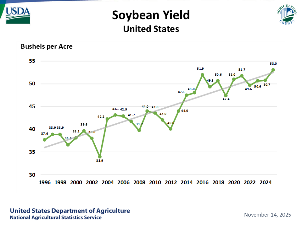
Crop yields with climate change/increasing CO2........soybeans:
Yields have doubled in the last 40 years:
https://www.nass.usda.gov/Charts_and_Maps/Field_Crops/soyyld.php
++++++++++++++
Another item related to this is his use of climate models with handpicked equations that don't take into account the LAW OF PHOTOSYNTHESIS.
Look what reality models using the law of photosynthesis(and observations, like that of the soybean graph) show:
Re: Fake beer crisis/Death by Greening!
By metmike - May 11, 2021, 2:43 p.m.
https://earthobservatory.nasa.gov/images/146296/global-green-up-slows-warming
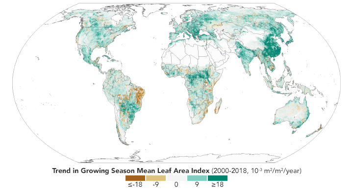
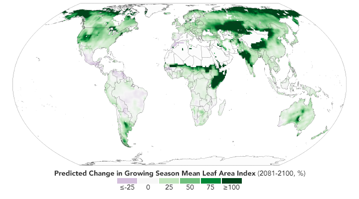
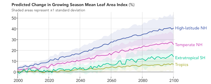
"The paper’s authors reviewed more than 250 published articles that have used satellite data, modeling, and field observations, to understand the causes and consequences of global greening. Among the key results, the authors noted that on a global scale greening can be attributed to the increase of carbon dioxide in the atmosphere. Rising levels of carbon dioxide increase the rate of photosynthesis and growth in plants."
metmike: Why isn't this paper, based on 250........let me repeat that number 250 published articles using the best technology known to science............getting much news coverage?
Because they don't want you to know this.
From the projections: According to climate models, the future looks even greener. The second map shows what the green-up might look like in the future based on the Coupled Model Intercomparison Project (CMIP5) climate model, under a scenario in which increases in greenhouse gases lead to almost 5° Celsius (9° Fahrenheit) of warming by the end of the 21st century. Specifically, it shows the predicted change in the growing season’s “leaf area index” from 2081-2100 relative to 1981-2000. The chart below the map shows the predicted changes by latitude. Notice that high latitudes in the Northern Hemisphere are still expected to change the most.
metmike: There is almost no chance we will see that amount of warming.
And the IPCC's record, as I showed earlier includes a complete nonsense, 0% chance of happening scenario, RPC 8.5 climate model run that was pure politics and based on using equations to simulate the scariest outcome they could manufacture to get people to reject fossil fuels. One of the most corrupt, fake science demonstrations that I witnessed in my life.
He get's called out here:

https://rogerpielkejr.substack.com/p/no-rcp85-did-not-become-implausible
“[I]t is incontrovertible that rapid cost declines, investment in, and deployment of clean energy technologies in the past 15 years have changed the plausible scenarios for fossil fuel use later in this century. These new scenarios reflect this success.”2
Now we come to the worst part of all. The solutions that Zeke and others propose include what I have referred to as the dumbest idea in all of human history.
Dumbest idea in history
14 responses
Started by metmike - Feb. 12, 2022, 2:53 a.m.
https://www.marketforum.com/forum/topic/81707/
+++++++++++++
In their paper, Cyril Brunner, Zeke Hausfather and Reto Knutti suggest their findings demonstrate that short-term strategies for carbon storage will lead to captured carbon being released before it can be recycled naturally in Earth’s atmosphere, reported Phys.org.
“We found that storage duration substantially affects whether net zero emissions achieve the desired temperature outcomes. With a typical 100-year storage duration, net zero CO2 emissions with 6 GtCO2 per year residual emissions result in an additional warming of 1.1 °C by 2500 compared to permanent storage, thus putting the internationally agreed temperature limits at risk,” the scientists wrote.
Brunner, Hausfather and Knutti focused on storing carbon “durably” — part of the target set by the Intergovernmental Panel on Climate Change. They noted that many strategies developed to meet the goal use the century benchmark as a means of “durable” carbon sequestration.
“The scientifically recognized definition of Carbon Dioxide Removal requires removed atmospheric CO2 to be stored ‘durably’; however, it remains unclear what is meant by durably, and interpretations have varied from decades to millennia,” the trio wrote in the study.
They also pointed out that most storage efforts that last 100 years are natural, which means they are vulnerable. One forest fire has the capability of releasing tons of sequestered carbon back into the atmosphere. Because of this reality, they suggested only thousand-year carbon storage strategies be used.
++++++++++++
Projecting global warming out to the year 2500, above is brain dead, junk science!! You don't need to have a bunch of degrees to understand that. Just common sense and critical thinking. I feel great embarrassment for the scientific community and sadness for the world they negatively impact when they steal the intelligence of people who read complete crap like this.
Their solution would cost trillions of dollars and be entirely COUNTER productive, with the possible exception that we might want to retrieve all that stored CO2 in 100 years because atmospheric levels of this beneficial gas will be TOO LOW! However, that is the diametrically opposed, polar opposite of their objective.
Considering that fossil fuels will start running out in less than 50 years and atmospheric CO2 levels will BE PLUNGING before 2100!!!!
This is the opposite of science. It's purely political and agenda driven nonsense based on impossible simulations on computers programmed with equations to project catastrophe's over 400 years from now to manipulate people's actions and convince them to follow their horrible ideas right now in order to stop the catastrophe from happening to our great, great, great, great, great, great, great, great, great, great, great, great, great, great grandchildren!
CO2 & Climate discussion July 2026
By metmike - July 10, 2026, 7:26 p.m.
+++++++++++++
CO2 & Climate discussion July 2026
By metmike - July 10, 2026, 7:30 p.m.
++++++++++++++++++
CO2 & Climate discussion July 2026
By metmike - July 10, 2026, 9:49 p.m.
++++++++++++
Re: Re: Re: Global temperature anomaly for June 2026-UAH/CO2 & Climate discussion By metmike - July 12, 2026, 4:02 p.m.
Now on Chris Martz.
He has become the young rock star in the climate skeptics community. Unfortunately, his objective is to find as much wrong with what the mainstream climate science, gatekeepers have stated and this has resulted in instances of him twisting facts or misrepresenting data to make it appear that the other side is completely wrong, even on issues when they are at least partially right.
Here's an example:
·
And yet, 11-years later after the Arctic was forecast to be ice-free in summer, there's more sea ice heading into the summer in the Arctic this year than there was in 1989. NSIDC's Dr. Mark Serreze said in 2008 that the Arctic sea ice was in a “death spiral.” This doesn't sound https://x.com/KatyDuke/statu/KatyDuke/status/1782816714633236487
https://x.com/i/status/1782819460606238840
++++++++++++
Instead of just telling us about the busted ice-free forecasts, because his quest is to defend 1 side to beat the other side(not just show authentic science), he had to throw in this: "there's more sea ice heading into the summer in the Arctic this year than there was in 1989."
If he really stated that, it was intentionally misleading/biased junk science.
Arctic ice is not melting as fast as predicted and the rate of melting has slowed greatly, to even my surprise in spite of the planet continuing to warm but it's NOT recovered!
Latest global ice 1-3-26
Started by metmike - Jan. 3, 2026, 2:07 p.m.
He's still just 23 years old, believe it or not and I will chalk up some of that to his young age. I was still saying and doing really dumb things that maturity and knowledge fixed well after reaching 23 years.
Regardless, he should be held accountable to scientific standards and physical principles of the universe, using honest/authentic data that apply to things that are 1 billion years old!
+++++++++
++++++++++++
I give articles like this ZERO credibility, regarding authentic science but am showing it for readers to understand his sudden fame and huge following in the climate skeptics world.
This may be impacting what he says and it is CRYSTAL CLEARLY impacting the mainstream climates crisis community's response. They see him as a huge threat and are on the constant attack, trying to nitpick everything he states, even when he has it right.
On this particular thread, Chris Martz, by my scorecard recorded a knock out punch to the Jake Hausfather's that struggle to explain away how something so extreme as the 1930's Dust Bowl and heat could have happened BEFORE the fake climate crisis.
It's actually easy to explain if they would just follow this principle:
Here's another reminder of the golden rule defining this realm:
It really boils down to this, once again(Cliff Mass can be counted on as an elite source for using objective, authentic science)
https://cliffmass.blogspot.com/2016/03/the-golden-rule-of-climate-extremes.html
The GoldenRule
Considering the substantial confusion in the media about this critical issue, let me provide the GOLDENRULE OF CLIMATE EXTREMES. Here it is:
The more extreme a climate or weather record is, the greater the contribution of natural variability.
Or to put it a different way, the larger or more unusual an extreme, the higher proportion of the extreme is due to natural variability.
This is not to ignore that Chris Martz is doing a much, MUCH better job at representing AUTHENTIC science than Zeke and his mainstream climate crisis gatekeepers.
The eruption of Mt. Etna in Italy on Monday has once again sparked some debate about the sources of the increase in carbon dioxide (CO₂) level since 1850.
But, the rise in CO₂ concentration has mostly, if not entirely, been man-made. Please caution that I am not talking about air temperature in this thread, so don't bite my head off. I am only discussing the CO₂ level. First, we need to understand the carbon cycle.
Every year, this is how much CO₂ (in petagrams of carbon, PgC) is emitted into the Earth's atmosphere, on average, by various sources:
1. Plant respiration: +102.2 PgC
2. Ocean surface: +101.0 PgC
3. Wildfire: +11.6 PgC (some of that is natural, some of it isn't)
4. Fossil fuel combustion: +7.8 PgC
5. Land use change: +1.1 PgC
6. Freshwater outgassing: +1.0 PgC
7. Volcanic eruptions: +0.1 PgC
Total outsourced: 229.8 PgC
Of that 229.8 PgC outsourced, 220.9 PgC (~96.1%) of that is natural. So, yes, >96% of CO₂ emitted is natural. But, there’s a catch. Let’s now look at how much CO₂ is taken up by Earth's biosphere each year:
1. Photosynthesis: -123.0 PgC
2. Ocean surface: -90.0 PgC
3. Marine biota: -11.0 PgC
4. Freshwater: -2.8 PgC
5. Rock weathering: -0.4 PgC
Total uptake: 227.2 Pg
So, the Earth’s biosphere absorbs more CO₂ than it outgasses each year, plus over half of what humans emit through fossil fuel combustion and land use change, but not all of it. This leaves us with some residual CO₂ in the air, which over time, accumulates and leads to a steady rise in concentration. This is the main reason why the atmospheric CO₂ concentration has increased by 51% since the 1850s.
This isn’t alarmism. It is just a basic mathematical budget. How much this affects temperature is an entirely different discussion.
In my opinion, young Chris Martz is very close to having everything right but intentionally downplays extremes (to offset the other sides intentional exaggerations).
He should fully embrace extremes for what they are when they happen. He looks bad when not doing that and has so many mainstream, fake climate crisis enemies that will pounce on him for not doing so because he threatens so many of their false narratives.
Zeke Hausfather is the type of fork tongue climate scientist, which was one reason I took over MarketForum to speak out against.
Hijacking climate crisis for an agenda and stealing people's intelligence about climate, biology and agronomy along with promoting some of the dumbest idea's in human history.......sequestering CO2 today, deeply into the ground at a cost of many trillions because of galactically absurd projections of CO2 and a climate crisis to the year 2500.........when the biggest problem will actually be the DROPS in CO2 later this century when fossil fuels run out.
Zeke is in the energy business.
How can he possibly not know that fossil fuels are finite and will start running out within 50 years?
I already completely debunked the ludicrous myth that this CO2 stays in the atmosphere for hundreds of years.
Just during our growing season in the Northern Hemisphere, CO2 levels drop every single year because the plants are actually taking out more than every source going in, including all the CO2 emissions from burning fossil fuels.
It's only when our plants in the Northern Hemisphere go dormant (Winter) that atmospheric CO2 goes up.
The planet has massively greened up by 28%. Every 5 ppm added, increases plant growth by 1%. +140 ppm = +28%.
In the next couple of decades, the INCREASING DEMAND from the massively greening planet will continue as it has every single year for the past 100+ years.
With an even greater global demand base of plants that feed on atmospheric CO2, what will happen when fossil fuels start running out and we don't have the surplus that exceeds the amount those plants need to continue to expand?
At first, the rate of increase for atmospheric CO2 will slow down. Then it WILL reach a steady state for several years with the amount going in, equaling the amount coming out.
Then, as fossil fuel use continues to drop..........BECAUSE THEY ARE RUNNING OUT and the cost for reaching near tapped out fossil fuel sources will escalate higher and higher as they become more scarce, guess what happens next with near 100% certainty????
The huge demand base to feed a very greened up planet will EXCEED the total going in and atmospheric CO2 levels drop. Slowly at first but potentially even faster than they went up if we would cut back too quickly.
This will have all played out BEFORE 2100.
Knowing this with extremely high certainty, for me make's climate scientists like Zeke Hausfather's projecting out to the year 2500 just scientific charlatanism.
It's possible that this is just bias and he and his colleagues, as educated as they are, in reality are just ignorant from cognitive bias and because they want to believe in things that violate scientific principles.
But there's no excuse for practicing the ANTI scientific method as a scientist and using their positions as elite authorities that serve as the message gatekeepers to steal people's intelligence for THEIR PERSONAL AGENDA's and flawed understanding of science.
The United Nations is a wonderful organization that has saved many millions of lives and made billions of lives better.
With 1 exception. They created the junk science, IPCC to hijack climate science, even REWRITE climate history for their agenda.
Here's them doing it:
The myth of affordable green energy is over
By metmike - Oct. 12, 2023, 11:19 a.m.
++++++++++++
That's not speculative. It's them rewriting climate history, with all the world's climate scientists following the IPCC's report's like religions follow their bible(s).
Greta Thunberg was recruited and coached by the IPCC/UN for their agenda.
Re: Poisoning the minds of young people
By metmike - Aug. 14, 2023, 9:34 p.m.
Re: UAH Global Temperature Update for May, 2023: +0.37 deg. C
By metmike - June 3, 2023, 11:45 a.m.
+++++++++
The IPCC won the Nobel Peace Prize with Al Gore for their contributions towards stealing people's intelligence and scaring them about a climate optimum for life on the planet, twisting it into a crisis.
US Climate Is Getting Less Extreme, Not More
By metmike - Jan. 20, 2023, 2:14 p.m.
Re: Re: Re: Re: US Climate Is Getting Less Extreme, Not More
By metmike - Jan. 20, 2023, 3:06 p.m.
Even though the United Nations is the most powerful, corrupt and dangerous organization on the planet...........their sustainable development plan to help the poor countries has some wonderful objectives that I strongly support.

+++++++++
The world is doomed!
Started by metmike - Nov. 5, 2022, 11:29 a.m
. https://www.marketforum.com/forum/topic/90335/
+++++++++
Re: Re: Re: Re: Quote of the day-June 2021
By metmike - June 11, 2021, 3:17 a.m.
United Nations, June 2021: " Science tells us these next 10 years are our final chance to avert a climate catastrophe"
https://www.marketforum.com/forum/topic/70534/
United Nations June 29, 1989: "He said governments have a 10-year window of opportunity to solve the greenhouse effect before it goes beyond human control."
https://apnews.com/article/bd45c372caf118ec99964ea547880cd0
metmike: Wrong for 31 years and still wrong today. But we continue to carry their pessimistic, junk science message that is dragging down young people and stealing everybody's intelligence (that believes it) with propaganda about a fake climate crisis involving the building block of life on this greening planet............CO2.
I can't resist repeating this again because is soooo defines the fake climate crisis the past, almost 4 decades and because Zeke Hausfather is one of the climate scientists with the IPCC that continues to push this climate propaganda in 2026!
This is one of my favorites.............from 32 years ago:
PETER JAMES SPIELMANN June 29, 1989
https://apnews.com/article/bd45c372caf118ec99964ea547880cd0
UNITED NATIONS (AP) _ A senior U.N. environmental official says entire nations could be wiped off the face of the Earth by rising sea levels if the global warming trend is not reversed by the year 2000.
Coastal flooding and crop failures would create an exodus of ″eco- refugees,′ ′ threatening political chaos, said Noel Brown, director of the New York office of the U.N. Environment Program, or UNEP.
He said governments have a 10-year window of opportunity to solve the greenhouse effect before it goes beyond human control.
As the warming melts polar icecaps, ocean levels will rise by up to three feet, enough to cover the Maldives and other flat island nations, Brown told The Associated Press in an interview on Wednesday.
Coastal regions will be inundated; one-sixth of Bangladesh could be flooded, displacing a fourth of its 90 million people. A fifth of Egypt’s arable land in the Nile Delta would be flooded, cutting off its food supply, according to a joint UNEP and U.S. Environmental Protection Agency study.
″Ecological refugees will become a major concern, and what’s worse is you may find that people can move to drier ground, but the soils and the natural resources may not support life. Africa doesn’t have to worry about land, but would you want to live in the Sahara?″ he said.
UNEP estimates it would cost the United States at least $100 billion to protect its east coast alone.
Shifting climate patterns would bring back 1930s Dust Bowl conditions to Canadian and U.S. wheatlands, while the Soviet Union could reap bumper crops if it adapts its agriculture in time, according to a study by UNEP and the International Institute for Applied Systems Analysis.
Excess carbon dioxide is pouring into the atmosphere because of humanity’s use of fossil fuels and burning of rain forests, the study says. The atmosphere is retaining more heat than it radiates, much like a greenhouse.
The most conservative scientific estimate that the Earth’s temperature will rise 1 to 7 degrees in the next 30 years, said Brown."
+++++++++++++++++++++++++++
Instead of that, the planet massively greened up with a climate optimum for most life!
Re: Re: Re: Re: 50 years of Climate Forecasts
By metmike - Feb. 22, 2021, 1:02 a.m.
There is NO CLIMATE CRISIS! It's a climate optimum that we're having on this greening planet. I would bet John Kerry 1 million bucks that in 2030, if CO2 continues to increase that the planet will be even greener yet............and give him 10 to 1 odds.
It's such no brainer authentic science.
The 100% real reason that John Kerry and others, like AOC have this position and always use the year 2030 is this:
https://sdgs.un.org/2030agenda
We should be extremely for helping the less fortunate/poor in our world....... and there are a billion people on this planet that don't even have enough clean water to drink!
We should all be very much for less REAL pollution.
We should all be very much for conserving natural resources(cutting back on over consumption in the rich countries).
We should all be for alternative, clean energy sources........that make sense. Reliable, abundant and cheap.
But We must be against hijacking climate science, making up a climate crisis and even rewriting climate history to do those things.
We must use the truth and hold people accountable for telling the truth.
People have the right to know the truth and should not be tricked into following a plan for global socialism and wealth redistribution. They should be given the option to choose the path we take and not tricked to do things because they are very afraid of a made up climate crisis...........that only exists on worst case computer model simulations.
Seriously, scroll down at this link and note all the wonderful agenda's that the United Nation has for the planet and people living on it. I strongly support almost all of it.
However, corrupt people in the organization came up with a brilliant scheme 4 decades ago to hijack and rewrite climate science via creation of the IPCC (InterGOVERNMENTAL Panel on Climate Change) in order to scare people to accomplish their agendas.
Governments and their climate scientists around the world all jumped on board, accepting the IPCC reports as their climate bible. Providing hundreds of millions in grants for studies/research and papers to pay scientists for their contributions towards the climate crisis.
The crony capitalists jumped in quickly (wind farms, carbon sequestration for instance) that features many trillions.
It was a natural for environmental activists that sincerely want to save the planet(I'm one of those but not using this).
And the ratings driven media, with its own bias towards activism has been the perfect mouthpiece.
++++++++++
Take a look at this link again. Only this time, to appreciate all the awesome goals and altruistic endeavors that define the United Nations. I am a huge fan for most of their agenda!
However, much of #13 is built on an intentional scheme to bamboozle the world with junk science, sadly being passed along by many of its elite scientists.

https://www.un.org/sustainabledevelopment/development-goals/
Thanks, Mike! Wow, I’m impressed! You wrote a thesis. <G> Seriously, the amount of time/thought you put into this deserves kudos!
What I get out of this is that you likely align a good bit more with Chris than with Zeke. That’s no surprise, of course and as you hinted at with an earlier post.
But despite you aligning more with Chris, it is entirely possible that you’d make an exception and agree more with Zeke as regards this one particular article saying Chris’ chart is misleading for the reasons stated earlier ITT regarding an apples to oranges issue (time of observation and thermometer changes as well as change in geographic dist. of stations).
So, do you think Zeke is right in this case in his response to Chris’ viral chart? Or not?
Thanks, Larry!
I totally get that my lack of being concise made it almost impossible to figure out the response, so I'll compact it in this post.
1. Chris posted an accurate graph of US extreme high temperatures going back over the past 130+ years. He stated in the description that its US data and on the graph it's labelled the "Conterminous United States"
2. I saw nothing in his post that suggested anything global. The thing that stands out are the 1930's. However, the US climate was also less humid before climate change and drier(with drier soils) and with much less crops/vegetation so other decades besides the 1930s saw more extreme high TEMPERATURES in the old climate even if you reduce the highs by 1 degree because of different thermometers. Extra CO2 greening up the humid areas is a negative feedback to extreme highs.
3. I've showed the 1930's DECADE dozens of times here because it was such an extreme anomaly in the middle of a drier climate. We don't have temperature records from the 1800's but guess what? We had 3 similar, decade long dust bowls in the OLD climate with less CO2. I would bet lots of money that those Summers featured an unusually high number of extreme highs, even with global temperatures being less by 2 degrees.
4. The 1950's saw a similar but less lengthy period because of the droughts IN THE OLD CLIMATE. You seriously can't tell me that a thermometer measuring 1 deg. F too hot caused this below!!!!
AI Overview
5. The same thing today would result in everybody sounding the alarm about a climate crisis. But why don't we have this happen anymore? Like the 1800's and previously? Like the 1930's and some years prior to that? Like the 1950's? Like 1983 and 1988 but only 1 time(2012) since then? Climate Change is REDUCING the most extreme high temperatures except in the West because the West has:
1.Dry soils: that cause the sun to heat the air instead of evaporate moisture.
2. Low Dew Points. Dry air heats and cools faster than humid air with much wider diurnal temperature swings. Can you say "desert". Droughts in Summer = a big increase in record high temps.
3. Also the areas to the east(most of the country) with the higher dew points(than before climate change) are seeing the CO2 radiation absorption bands at least partially saturated by the overlapping H2O radiation absorption bands and REDUCING the extreme high temperatures compared to the old climate. The impact of CO2 is GREATER in dry air than in humid air. All cold air is dry. This is a huge reason for the highest latitudes of North America in Winter/Arctic to be warming the most on the planet. Even at -10 deg. and 100% humidity, that air has very little water vapor=dry!
I see no problem at all with what Chris posted.
With regards to Zeke. Clearly he doesn't want to embrace the stone cold truth about the except 1that me heat in the past and why as I explained above.
He makes a good point about, potentially as much as 1 degree cooler thermometers today compared to the,past but that doesn't negate Chris's point at all. I just explained the solid principles in physics and meteorology that explain it.
And Zeke posted a graph of global high temperatures to offset Chris's post of US temperatures. I saw nothing in Chris's post implying anything global in a post about recent heat in the United States. Every time I post historic data from the US that is accurate, do I need to show the rest of the world?
Zeke fake conceded to the 1930's being extremely hot but then went on to provide his own information that tried to downplay it because either he's biased or really doesn't understand why this country east of the Rockies had much more extreme heat BEFORE climate change. After reading his stuff, I would say that both of those apply big time.
Zeke also included a bs, speculative explanation for why hot days might be double counted in the 1930s. The reality is that ZEKE IS WRONG and won't accept what Chris's graph indisputably proves.
If you read my back ground check on Zeke, you will see clearly why he behaves like this. He is exactly the type of climate scientist that I began speaking out against over 2 decades ago!
He practices the ANTI scientific method(defending what he wants to believe and ignoring other scientists data that contradict that).
He follows models that have hand picked equations that simulate an atmosphere/conditions which are based on HIS belief system. Absurdly projecting a crisis out to the year 2500. Seriously out to 2500! Then he proposed carbon sequestration. The dumbest idea in human history that would cost trillions and be COUNTER productive.
Viral graph on # of U.S. highs of 95+ dropping is misleading but
By metmike - July 24, 2026, 2:32 p.m.
Zeke has been a contributing author for the IPCC that hijacked climate science and REWROTE climate history and is the #1 entity that wrecked authentic climate science. The world's climate scientists use the IPCC as the climate science "bible" the same way that religions follow there bibles BASED ON FAITH.
The IPCC turned climate science into politics/governmental agenda, crony capitalism, extreme environmental activism of the sincere but misinformed and media ratings. A small circle of these climate scientists serve as gatekeepers (Zeke is 1 of them, apparently). They practice the anti scientific method, defending their biased science and determined to discredit good scientists practicing the scientific method. Scientists get rewarded for blatantly biased studies that contribute towards the fake climate crisis.
+++++++++++
AI Overview
I found this online:
https://x.com/i/trending/2080004774238253136?lang=en
Meteorologist and Climate Scientist Clash Over U.S. Heat Trends Chart
Last updated
Chris Martz plotted raw NOAA data from 543 long-record stations, highlighting Dust Bowl-era highs like 33 days above 95°F in 1936 and 18% fewer such days from 1961-2020 compared to earlier decades. Zeke Hausfather countered that the raw data overlooks biases like afternoon observation timing before the 1960s and cooler modern sensors, with Berkeley Earth adjustments showing recent years like 2011 rivaling the 1930s nationally. Both agree the 1930s were extreme in the Midwest and Plains, while John Christy's analysis of 1,211 stations finds modest declines in hot extremes nationwide since 1899.
This story is a summary of posts on X and may evolve over time. Grok can make mistakes, verify its outputs.
Zeke Hausfather wrote a lengthy article today trying his best to refute my viral bar chart showing that the average per station number of hot days in the U.S. have actually declined significantly since the start of the 20th century. Hausfather's biggest complaints were that my graph (1) “overrepresents” Midwestern stations and (2) that I did not adjust the temperature data for the supposed Time of Observation Bias (TOBS). On the second point, he is correct, but as it turns out, it makes little difference at all (only a small error).
https://www.theclimatebrink.com/p/hot-days-cold-thermometers
Here is my response: The data plotted in my bar chart are weighted by area (which Zeke would have known if he bothered to do any actual research). So, where there are dense station clusters that fit my parsing criteria, I weighted them lower than the others and vice versa. That's scientifically defensible. Time of Observation Bias (TOBS) isn't that big of a factor. Dr. John Christy, a principal research scientist at the University of Alabama in Huntsville, published a paper in April on temporal trends in high and low temperature extremes in the U.S. since 1899. Christy found that TOBS only introduces an insignificant 4% increase in hot days in the early part of the record, and that, ““%20Chris%20Martz%20on%20X%20Zeke%20Hausfather%20wrote%20a%20lengthy%20article%20today%20trying%20his%20best%20to%20refute%20my%20viral%20bar%20chart%20showing%20that%20the%20average%20per%20station%20number%20of%20hot%20days%20in%20the%20U.S.%20have%20actuall[...].png) https://link.springer.com/article/10.1007/s00704-026-06200-3
https://link.springer.com/article/10.1007/s00704-026-06200-3
And it just so happens that Dr. Christy also plotted the average number of days per station per year reaching 95°F (35°C) in Fig. 16 of his paper. Even with the TOBS accounted for, it does little to change the results I got without applying the TOBS adjustments, nullifying Dr. Hausfather's arm-waving that's dressed up in science jargon and fancy graphics. At best, my count hot days is overestimated by 4%, which is not a serious error. The TOBS assumption rests on the belief that COOP station observers didn't know how to reset their min-max thermometers properly, which “double counted” hot days prior to ~1970. Geologist Tony Heller described this very nicely in an August 2017 blog post, where he wrote,
%20Chris%20Martz%20on%20X%20Zeke%20Hausfather%20wrote%20a%20lengthy%20article%20today%20trying%20his%20best%20to%20refute%20my%20viral%20bar%20chart%20showing%20that%20the%20average%20per%20station%20number%20of%20hot%20days%20in%20the%20U.S.%20have%20actuall[...].png)
But when you look at the daily observations (and I do every day because of a research project I'm working on with Christy), you do not typically see duplicate Tmax values, which would be the case if TOBS were a serious problem at large. What you do see are a one-day mismatch between morning and afternoon sites, so Tmax values for the afternoon sites have to be moved back a day for adjustment. But that doesn't change the number of hot days or duration of extreme heat events all that much like Dr. Hausfather (who I do respect) and goons like Dr. Andrew Dessler claim. To assume that the raw daily Tmax values need some MAJOR adjustments beyond area-weighting (which I did do) and moving them back a day for good measure is to assume that the trained volunteers who took the measurements were complete morons who did not know how to operate their equipment. Given that we built the Golden Gate Bridge, Empire State Building, and Hoover Dam the 1930s, it is difficult to believe that people who were trained to record temperature observations for the federal government couldn't do that simple task.


++++++++++++++++
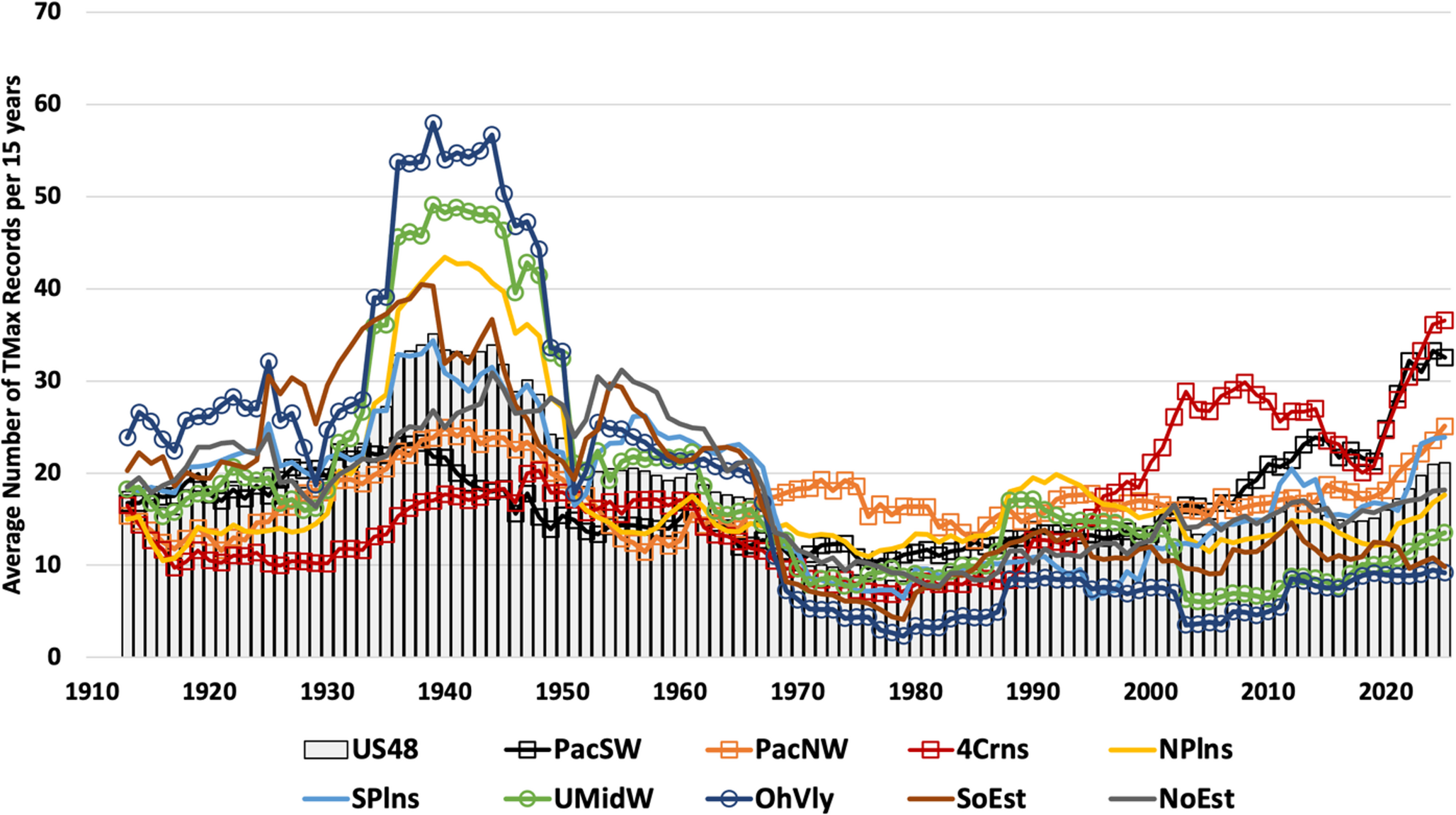
metmike: Here's more from that study that Chris mentioned. Please note the huge increase in hot days in the Pacific Northwest, Pacific Southwest and 4 corners/S.Plains. As we've been explaining, THOSE areas are much drier than the rest of the US and areas with lower dewpoints (northern latitudes and deserts) on the planet are seeing warming rates from the increase in CO2 MUCH greater than warm/humid places because the radiation absorption bands of H2O OVERLAP and swamp some of the CO2 radiation absorption bands.
The other areas, with higher dew points AND densely packed rows of corn/crops/vegetation in the Midwest, Ohio Valley, Southeast and even N.Plains in the growing season are the places seeing declines in hottest day time readings. However, those places are setting numerous record warm lows, year round. A big part of that is those higher dew points.
Dry air and dry soils also heat up much faster as already mentioned X 10 here recently.
https://link.springer.com/article/10.1007/s00704-026-06200-3
++++++++++++++++
Larry,
Sorry if this wasn't the answer that you wanted but I spent time to get it right and provide oodles of science/evidence.
Re: Re: Re: Re: Re: Re: Re: Re: Re: Severe storm risk 7-26-26
By metmike - July 26, 2026, 10:26 p.m.
These were the observations at Evansville, IN for 4-5-6pm on July 26, 2026.
The dew point readings were 80-80 and 81.
The 81 deg. F dewpoint tied the record for highest dew point in history at this location. It happened on 4 previous occasions.
Was the 3 consecutive hours at 80 or higher a record???
I doubt I will be able to find that record.
https://forecast.weather.gov/data/obhistory/KEVV.html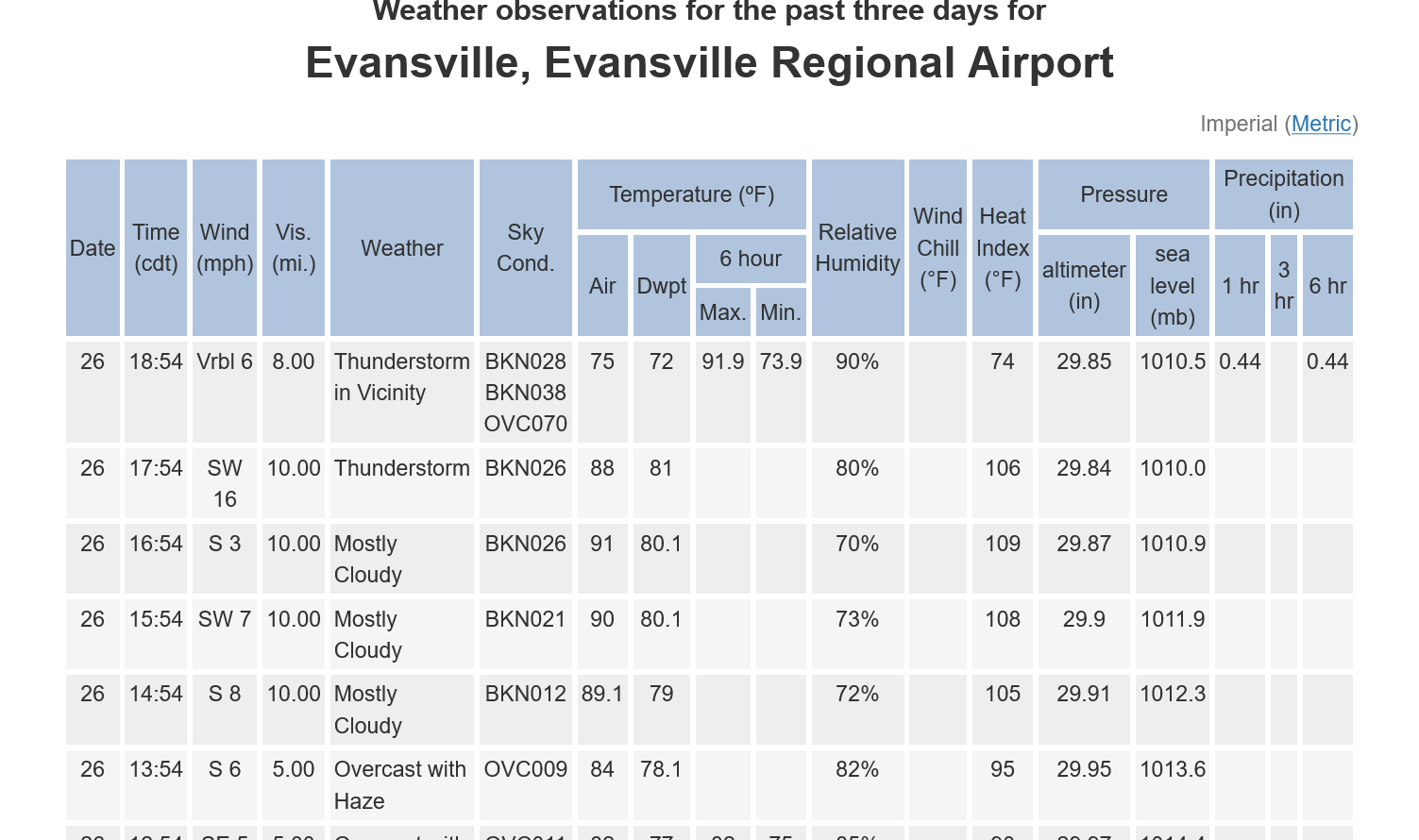
++++++++++++
This is more evidence of powerful climate change in the Midwest.
LESS extreme highs in the Summer but MUCH higher dew points and record warm nights.
During the Dust Bowl, it's likely that almost all the heat waves featured dew points below 70 degrees. Probably many of them with dew points below 60!
You need that and bone dry soils to generate the extreme heat that we had in the 1930's, as well as the early/mid 1950's during a 3 year stretch of drought and extreme heat.
And during all the other outbreaks of the most extreme heat (as defined by ultra high thermometer readings) in the past, including the last widespread Midwest drought in the Midwest in 2012 with already elevated CO2 levels.
++++++
My first Summer as chief meteorologist in Evansville, IN was 1983. We always show record highs and lows for the date.
I had already studied the past weather in that location as much as was possible back in those days with no internet and very limited data.
What struck me the most were the record highs in July 1936. 7 consecutive days with high temperatures of 103 deg F or higher.
Even if the thermometers were 1 deg. cooler before 1980, that would be 7 consecutive days with high temperatures of 102 deg. F or higher. Every bit as impressive!!!!
+++++++++++++++
The local NWS did a comprehensive study for all weather metrics in this area/Evansville but they started with 1950 (which is when the Paducah site opened).
The Evansville NWS has records going back to 1897. I would really be interested in the heat index here in the 1930's.
Annual Heat Index Statistics
Highest Heat Index By Year
All Heat Index Readings of 110 or greater by Year
Again, this is only for 1950 and later.
https://www.weather.gov/pah/EvansvilleHeatIndexClimatology
This is what I got from counting the number of heat index readings of 110 or higher for each decade below. The higher dew points from climate change is mostly from the massive increase in transpiration from tightly packed rows of corn but also from the increase in CO2. Daytime heat has been so suppressed(moist soils covered with corn plants that transpire and turn UV radiation from heat to stored chemical energy in the plants ) that even with the higher dew points, climate change is failing to keep up with the heat index in the past.
1. 1980s-18
2. 1990's-17
3. 1950's-10
3. 1970's-10
3. 2000s-10
3. 2010s-10
7. 1960's-5


