https://assets.ino.com/img/sites/ino/email/12557.jpg
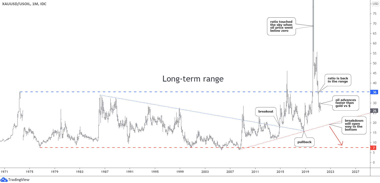
here is a long term graph of the gold-oil ratio. the average seems to be somewhere around 20.
we are currently around 25. (and seem to be still heading lower).
i would expect the market to favor oil over gold for a few more months. when we get down to 20, we should see a move higher for a year or so.
20 to 1 might mean something like gold at 2000, and oil at 100. or gold at 1900, oil at 95.
thanks for sharing an interesting spread bear!
Thanks for the chart - can you reproduce it with a log scale? Ratio charts work better IMO with a log scale.
Great to hear from you cello!
Please don't be disappointed if we are unable to fulfill your request.
What are your thoughts on these markets?