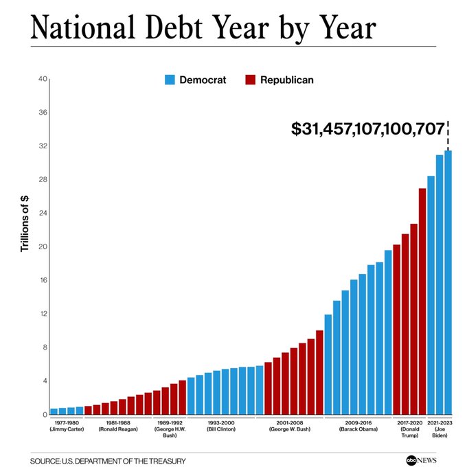
Here is an interesting chart proving that they are all idiots!
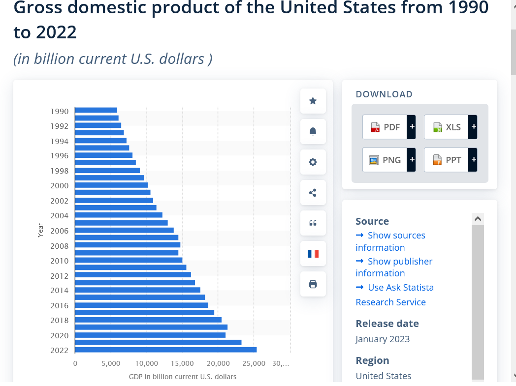
I added another bar chart below for the GDP in billions. the graph above is in trillions.
The GDP went up from 5.9 trillion to 25.5 trillion an increase to a number that's 4.3 times greater.
The National Debt went from 3.5 trillion (below the GDP) to 31.5 trillion (above the GDP) an increase by to a number that's 9 times greater.
However, that doesn't accurately capture the changes in the rates/trend lines.
Below, the rate of the GDP is pretty steady.
Above the rate of the Debt is a greatly steepening curve. That rate is going exponential and is unsustainable.
https://www.statista.com/statistics/188105/annual-gdp-of-the-united-states-since-1990/
not only up but up by an increasing rate.......no big deal just on the way to a train wreck
Exactly right, mcfarm.
If you draw an uptrend line for each decade, it gets steeper and steeper and steeper.
The only exception to that was during the Bill Clinton administration.
5 facts about the U.S. national debt
https://www.pewresearch.org/short-reads/2023/02/14/facts-about-the-us-national-debt/
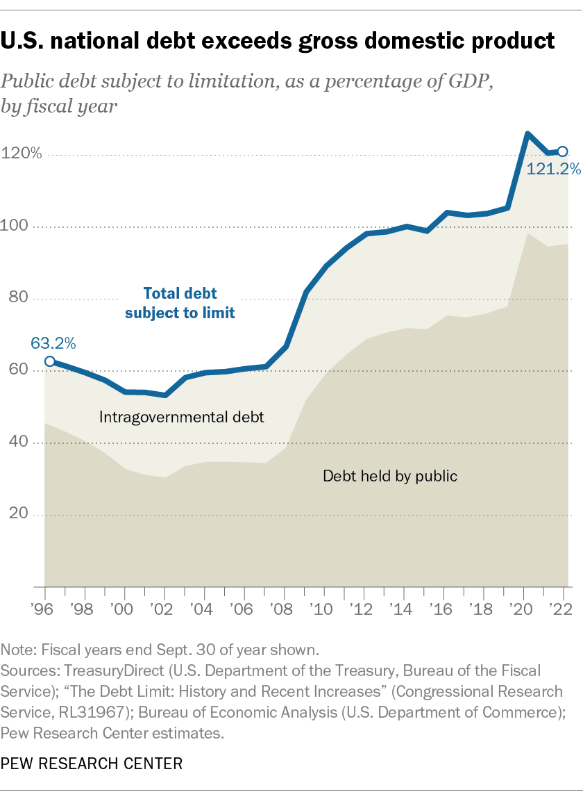
You can see on the graph above that the national debt in the late 90's was DECREASING as a % of the GDP.
Starting in 2002(Bush-2) it's reversed and began climbing. I remember being upset when Bush, instead of using a budget surplus to pay down the debt, instead gave us tax rebates with the money.
Obama's first term saw the steepest/biggest increase in this ratio. This was followed by a less steep but still bad increase, until the spike up from COVID money during Trump.